Tuesday, 29 September 2009
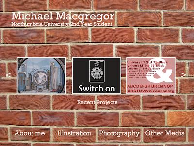
Having just had our first crit with thomas about our web designs, the majority of the group thought my 2nd website design was the strongest. The brick wall design didnt fit in well with the selection and tone of typeface where as the wooden design seemed a bit plain and ordinary. The white design however worked better and was a more sharp, proffessional looking layout.
Monday, 28 September 2009

This is the second design for my web design page. This is a more basic idea than the first, yet the middle images of my work is stands out quite a bit when you first visit my page and I like this idea. If I am able to, I will try to make these middles images rotate when you first visit the page. Whether my skills in fireworks and dreamweaver at this point will allow this is another matter though!

This is my first design template for my web design homepage. I went for the brick background so that the site didnt seem to plain, and the white text stands out more. The images in the middle of the page are recent projects, and when I come to develop my website I will try to have the arrows at the sides scrolling through thumbnails of my work.
Thursday, 24 September 2009
Subscribe to:
Comments (Atom)


